IDENTITY
DK Networks' corporate identity is a visual promise to customers and partners. These guidelines cover our symbol, colors and wordmark.
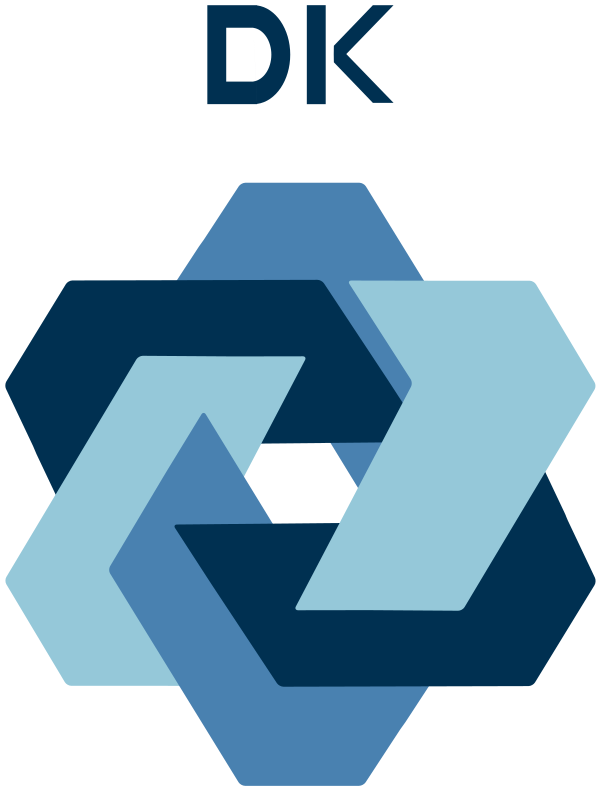
uses soft, repeating geometric forms to represent connectionbetween creative ideas, passion and the determination to build a distinctive network.
Three interlocking, rotating ribbons represent logistics, food and future businesses,growing together within one network. The continuous shape, without a visible beginning or end, also expresses our belief in sustainable connections.
The blue palette creates a calm, trustworthy company image.

COLOR
Our brand palette consists of three blue tones, each with a distinct purpose.
PRIMARY
# 003051
R: 0 G: 48 B: 81
The primary color appears in the logo, headlines and navigation, conveying trust and stability.
SECONDARY
# 4981b0
R: 73 G: 129 B: 176
A secondary color supports the primary palette in highlights, icons and graphic elements.
ACCENT
# 95c8d9
R: 149 G: 200 B: 217
The accent color is used sparingly for buttons, links and highlights.
APPLICATION
Choose the logo version to suit the background: full color by default, monochrome for single-color printing and reversed on dark backgrounds.
PRIMARY
Full-color version
MONOTONE
Monochrome for print
REVERSE
For dark backgrounds
DK NETWORKS GROUP